Showing posts with label Power BI. Show all posts

Monday, June 19, 2023

Microsoft Fabric creates a Warehouse automatically - Microsoft Fabric - III

Discover the power of Microsoft Fabric in automating data warehousing with our latest video, “Microsoft Fabric creates a Warehouse Automatically”. This informative video demonstrates how you can effortlessly create a data warehouse without the need for complex and time-consuming traditional warehousing processes.

Join us as we explore how Microsoft Fabric automatically generates a default data warehouse, showcasing the transformation of Delta tables into accessible tables within the warehouse. Learn step-by-step how to create Delta tables in the lakehouse, enabling their visibility as fully functional tables in the data warehouse.

Furthermore, we explore the flexibility of the data warehouse, demonstrating how you can enhance it by creating custom views and stored procedures.  Additionally, we demonstrate the way of opening the warehouse as the default Power BI dataset for creating reports and dashboard.

Don't miss out on this informative video that provides valuable insights into Microsoft Fabric's data warehousing capabilities. Subscribe to our channel for more in-depth tutorials and stay up to date with the latest advancements in data management and analytics.


Sunday, May 14, 2023

Unleashing Power BI in Jupyter Notebook - Embed and Create reports

This video discusses two things:

  • Embedding Power BI report in Jupytor Notebook
  • Creating Power BI report directly in Jupytor Notebook.
Embedding Power BI is not something new, it was announced in May 2021. Creating Power BI report in Jupytor Notebook was announced in last month, April 2023. Both topics are discussed in detail with demonstrations. Following are discussed:
  • Powerbiclient Python package
  • Two Authentication method
  • Install powerbiclient in Jupytor notebook
  • Embed Power BI report in Jupytor Notebook
  • Add custom Notebook filter for filtering reports
  • Loading visual data into Pandas dataframe
  • Create Power BI report in Jupytor Notebook
  • Quick report feature and personalizing visuals
  • Publishing to Power BI service for sharing the dataset and report


Real-time Streaming in Power BI - Push Dataset

This video discusses the way of showing stream data with Power BI visuals, specifically with Push Datasets. Here is the content: 
  • Types of streaming datasets supported by Power BI
  • The way of creating the Push dataset
  • Sending values using a .Net application
  • Creating reports and dashboards visuals using streaming dataset.


Friday, June 5, 2020

Power BI Desktop Model – Connect from SSMS and Export more than 30,000 rows

This video shows the way of connecting to Power BI Desktop Model from SQL Server Management Studio and using it for various operations. Additionally this shows how to get data saved into csv files using SSMS when number of records exceeds 30,000.


Monday, May 11, 2020

Coronavirus (Covid-19) Dashboard solution with Power BI

If you are interested in #covid-19 statistics, check this #dashboard out. This has been developed using #powerbi, #azuresqldatabase and #azuredatafactory.

http://coronavirusexplorer.com/


Saturday, March 21, 2020

Power BI App for seeing Coronavirus - COVID-19 updates in Sri Lanka

Here is an Azure site built for showing updates related to Coronavirus - COVID-19, specifically for Sri Lanka.

This has been designed using Azure Data Factory, Azure SQL Database, Power BI and Azure App Services.

 Coronavirus COVID-19 - Sri Lanka - Update

Monday, February 18, 2019

Creating Paginated Reports with Power BI

Here is a video on Power BI Paginated reports. This videos discusses/demonstrates;

  • What is a paginated report?
  • Power BI support on paginated reports
  • Power BI configuration for paginated reports
  • Creating a paginated report using Report Builder
  • Publishing a paginated report sourced to local database, to Power BI portal.
Here is the video:

Monday, September 18, 2017

Self-Service Business Intelligence with Power BI


Understanding Business Intelligence

There was a time that Business Intelligence (BI) had been marked as a Luxury Facility that was limited to the higher management of the organization. It was used for making Strategic Business Decisions and it did not involve or support on operational level decision making. However, along with significant improvement on data accessibility and demand for big data, data science and predictive analytics, BI has become very much part of business vocabulary. Since modern technology now makes previously-impossible-to-access data, ever-increasing data and previously-unknown data available, and business can use BI with every corner related to the business for reacting fast on customers’ demand, changes in the market and competing with competitors.

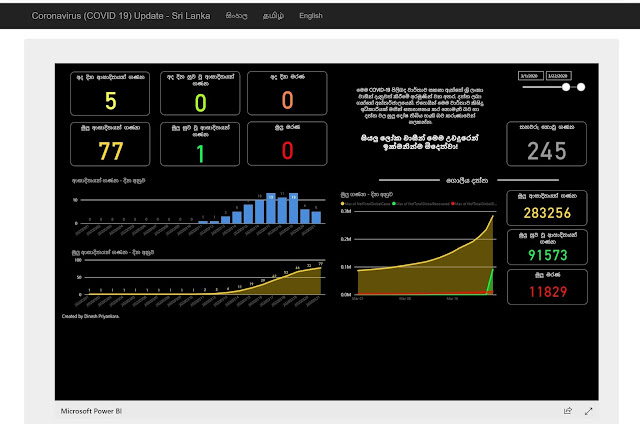
The usage of Business Intelligence may vary from organization to another. Organizations work with large number of transactions need to analyze continuous, never-ending transactions, almost near-real-time, for understanding the trends, patterns and habits for better competitiveness. Seeing what we like to buy, enticing us to buy something, offering high-demand items with lower-price as a bundled item in a supermarket or commercial web site are some of the examples for usage of BI. Not only that, the demand on data mashups, dashboards, analytical reports by smart business users over traditional production and formal reports is another scenario where we see the usage of BI. This indicates increasing adoption of BI and how it assists to run the operations and survive in the competitive market. 

The implementation of traditional BI (or Corporate BI) is an art. It involves with multiple steps and stages and requires multiple skills and expertise. Although a BI project is considered and treated as a business solution than a technical/software solution, this is completely an IT-Driven solution that requires major implementations like ETLing, relational data warehouse and multi-dimensional data warehouse along with many other tiny components. This talks about an enormous cost. The complexity of the solution, time it takes and the finance support it needs, make the implementation tough and lead to failures but it is still required and demand is high. This need pushed us to another type of implementation called Self-Service Business Intelligence.

Self-Service Business Intelligence

It is all about empowering the business user with rich and fully-fledge equipment for satisfying their own data and analytical requirements. It is not something new, though the term were not used. Ever since the spreadsheet was introduced and business users manipulate data with it for various analysis, it was time that Self-Service BI appeared. Self-Service BI supports data extractions from sources, transformations based on business rules, creating presentations and performing analytics. Old-Fashioned Self-Service BI was limited and required some technical knowledge but availability of modern out-of-the-box solutions have enriched the facilities and functionalities, increasing the trend toward to Self-Service BI.

BI needs Data Models. Data Model can be considered as a consistence-view (or visual representations) of data elements along with their relationships to the business. However, data models created by developers are not exactly the model required for BI. The data model created by developer is a relational model that breaks entities to multiple parts but the model created to BI has real-world entities giving a meaning to data. This is called as Semantic Model. Once it is created, it can be used by users easily as it is a self-descriptive model, for performing data analytics, creating reports using multiple visualizations and creating dashboards that represent key information of the organization. Modern Self-Service BI tools support creating models, hence smart business users can create models as per requirements without a help from IT department.

Microsoft Power BI


Microsoft offers few products for supporting Self-Service BI. Microsoft Office Excel is the most widely-used spreadsheet software and with recent addition of four power tools: Power Pivot, Power Query, Power View and Power Map, it has become one of key software for performing Self-Service BI. In addition to that, Microsoft Reporting Services (specifically Report Builder) and SharePoint Services support Self-Service BI allowing users to perform some Self-Service BI operations.

Microsoft Power BI is the latest from Microsoft; a suite of business analytical tools. This addresses almost all Self-Service BI needs, starting from gathering data, preparation for analysis and presenting and analyzing data as required.

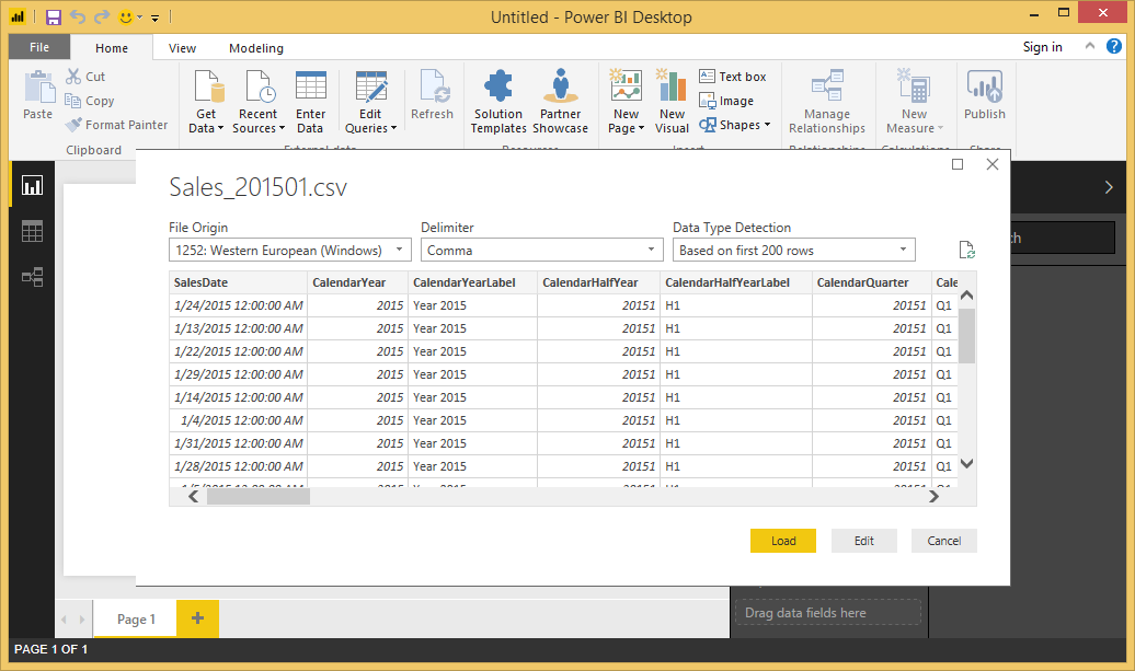
Power BI comes in two flavors: Power BI Desktop and Power BI Service. Power BI Desktop is a stand-alone tool that allows us to connect with hundreds of data sources, internal or external, structured or unstructured, model loaded data as per the requirements, apply transformations to adjust data and create reports with stunning visuals. Power BI Service can hold reports created by individuals as a global repository allowing us to share reports among others, create reports using shared/uploaded datasets and creating personalized dashboards.

Business Users who love Excel might see this as another tool that offers the same Excel functionalities. But it offers much more than Excel in terms of BI. Of course, you might see some functionalities that are available in Excel but not in Power BI. The biggest issue we see related to this is, entering data manually. Excel supports entering data, providing many facilities for data-entry but Power BI support on it is limited. Considering these facts, there can be certain scenario where Power BI cannot be used over Excel but in most cases, considering Self-Service BI, it is possible. The transition is not difficult, it is straight forward as Power BI easily corporates with Excel in many ways. This article gives a great introduction to using Power BI within Excel – Introduction to PowerPivot and Power BI. 

In order to perform data analysis or create reports, an appropriate data model with necessary data should be created. With traditional BI, relational and OLAP data warehouses fulfil this requirement but creating the same with Self-Service BI is a challenge. Power BI makes this possible by allowing us to connect with multiple data sources using queries and bring them together in the data model. Regardless of the type of data sources, Power BI supports creating relationships between sources with their original structures. Not only that, transformations on loaded data, creating calculated tables, columns and hierarchies are possible with Power BI data models. 

What about ETLing? How it is being handled with Self-Service BI or Power BI? This is the most complex and time consuming task with traditional BI and the major component of it is transformation. Although some transformations can be done in Power BI Data Model, advanced transformations have to be done in Query Editor that comprise more sophisticated tools for transformations. 

Selecting the best visual for presenting data and configuring it appropriately is the key of visualization. Power BI has plenty of visuals that can be used for creating reports. In addition to the visuals given, there are many other visuals available free, created and published by community supporters. If a specific visual is required, it can be downloaded and added easily.

Visualization is done with Power BI Report. Once they are created, they can be published to Power BI Service. Shared reports can be viewed via Power BI Service portal and native mobile apps. Not only that, Power BI Service portal allows users to create dashboards, pinning visuals in multiple reports to a single dashboard, extending Self-Service BI.

In some occasions, model is already created either as a relational model or OLAP model by IT department. When the model is available, users do not need to create the model for creating reports, they can directly connect with the model and consume data for creating reports. This reduces the space need to consume as user does not need to import data and offer real-time BI. Power BI supports making direct connections to certain relational data sources using Direct Query method and OLAP data sources using Live Connection method. 

Power BI is becoming the best Self-Service BI tool in the market. Microsoft is working hard on this, it can be clearly witnessed with monthly releases of Power BI Desktop and weekly upgrades of Power BI Service. If you have not started working with Power BI yet, register at http://www.powerbi.com and start using it. You will see Business Intelligence like never before.


Tuesday, July 11, 2017

Power BI supports numeric range slicer now

This is not something released this month but March 2017. These new capabilities of Power BI Slicer is available but many do not use it because it is still under Preview and it has some limitations. But, let's see how useful it is and what sort of limitations it has.

As you see below, I have created a Power BI Report connecting with AdventureWorks2014 local database using DirectQuery mode. This is the view I used as the source;

USE AdventureWorks2014;
GO

CREATE VIEW dbo.SalesByCustomer
AS
SELECT 
      p.LastName + ' ' + p.FirstName Customer
   , t.Name
   , SUM([SubTotal]) Amount
  FROM [Sales].[SalesOrderHeader] s
 INNER JOIN Sales.Customer c
  ON s.CustomerID = c.CustomerID
 INNER JOIN Person.Person p
  ON p.BusinessEntityID = c.PersonID
 INNER JOIN Sales.SalesTerritory t
  ON s.TerritoryID = t.TerritoryID
GROUP BY p.LastName + ' ' + p.FirstName, t.Name;

The table of the report is created with Customer and Amount. Then two slicers are added, one using Amount and other user Name (Territory).


You will not see Numeric Range Filter unless you have enabled it. For enabling it, go to File -> Options and settings -> Options -> Preview features and check Numeric range slicer.


Once it is enabled, whenever a numeric value is dragged to a slicer, range slicer will be appeared automatically.


Multiple options such as Less than or equal to, Greater than or equal to are given with it for filtering based on values in the input boxes.

We can use this without any issue but you will face a limitation if you publish this to Power BI Service and view it.


As you see, this feature is still not available in Power BI Service. There are two more things to remember on this feature, 1) measures that are created with the model or measure in Analysis Services models cannot be used with this, 2) this filters row data that come from the source, not aggregated data shown in visuals.

Wednesday, June 21, 2017

Power BI Parameters - What are they and when they can be used?

Microsoft Power BI supports adding parameters for queries and use them with various areas. However, since it has some limitations and cannot use with all areas, it has not been noticed much. Let's talk about Power BI parameters and see the way of using it.

Let's take a scenario and see how parameters can help on that. I have a set of CSV files that shows monthly sales. We need to to create a report using one of the files and then publish. Whenever the report needs to be refreshed for a different file, I need to change the data source by changing many things. What if I can just open the report using Power BI Desktop and change the source using a menu and get the report refreshed rather changing many things?

It can be done with Power BI Parameters. We can create a parameter with predefined values (in this case, source file names along with paths) and use it for changing the source.

Power BI Parameter can be created in three ways;
  • Parameter that accepts a value via an input box
  • Parameter that is formed using a predefined list
  • Parameter that is formed using another query
Parameter with a predefined list
Let's focus on the second one first. Here are the steps for creating a Power BI report with a parameter;

1. Open Power BI and connect with a CSV file. In my case, the file name is Sales_201501.csv.


2. Once the file is loaded, click Edit Queries in Home ribbon for opening Query Editor. You should one query under Queries

Parameters can be created only with Query Editor. However, created parameters can be accessed in both Query Editor and Data Model.

3. Click Manage Parameters in Home ribbon. Once the dialog box is opened, click New to create a new Parameter.

4. Name the parameter as SourceFile

5. Select Text for Type.

6. Select List of values for Suggested values.

7. Enter File Names along with paths.

8. Set Default Value as you need. This is the default value for the designer.

9. Set Current Value as you need. This setting is for the end user, or to use with the report level.


Now you should see the parameter in Queries. If you want to open it as another table in the data model, you can right click on it and select Enable Load. We do not need to enable this option for using the parameter at report level.

Now we need to make sure that source of our file is set with the created parameter. There are two ways of doing it. One is open the Advanced Editor and change M Code. Other way is, using Data source settings. Let's use the second option. If you need to know how the M Code is getting changed, open it and see after the change.

10. Click Data source settings in the Home ribbon. This opens the Data Source Setting dialog box.


11. Select the source and click Change Source.... This opens a dialog box that allows you to change settings related to your source.

12. You should notice that the button given for File Path has an option for creating parameters and selecting a parameter.


13. Select Parameter as the option and select name parameter created.


14. Click OK and close the Data source settings.

15. All set. Click Close & Apply for saving the queries and closing Query Editor.

16. Create a visual as you can distinguish results when different file is selected. This is what I created from my file.


Let's change the source using the parameter now.

17. Click down-arrow in Edit Queries in Home ribbon. You should see three options. Select the last one that is Edit Parameter.


18. You should see Enter Parameters dialog box that shows all parameters. Change the source file to different one.


19. Once clicked OK, you should be prompted for Applying. Apply the settings and you should see the report with new source now.


Like this way, we can use the parameter in other sections like Filtering rows in Query Editor, Replacing, etc. We still cannot use the parameter with DAX and it is one limitations.

Wednesday, June 14, 2017

Power BI - Scheduled Refresh section is not available in Settings

Power BI Desktop allows us to import data from files such as CSV and Excel. Once imported, it automatically creates a Model that can be used for creating reports. Good thing is, when we publish the report, Dataset that is created with the model is also getting published. This makes sure that we can create a schedule and refresh the Dataset published for seeing latest.

See below image. It shows the Gateway connection and Scheduled refresh settings for an uploaded text file. The Dataset created for the file is PowerBI Test Report.


Now if I get the settings related to the Dataset called Sales_201501;


I will not see same settings. What is the reason? It is also based on a text file.

This will happen when the uploaded Dataset is not a Model. This file has been uploaded using Power BI Services (app.powerbi.com), not using Power BI Desktop. Unlike Power BI Desktop, Power BI Services does not create a Model when a file is uploaded and uploaded file will be sill treated as a Dataset but not as a Model.

If you need to get your Dataset continuously refreshed by creating a schedule, then make sure that it is created using Power BI Desktop.

You can get the uploaded file refreshed automatically if the file is in either SharePoint or OneDrive.

Saturday, June 10, 2017

Power BI - Cannot highlight or pin visuals when grouped with shapes

Power BI allows us to add shapes like rectangle or oval for marking specific area, showing covered visuals as they are related and operate together. This is really useful when you need to highlight a group of visuals that has same behavior or the visuals are related to same business process.


When you have visuals, you can add the required shape and change properties as you need. The below image shows an added rectangle with specific Title and filled color with transperancy set to 75%.


Once added and set, it can be nicely seen with the report. But you may notice that you have lost some of the functionalities. You cannot highlight a slice of Pie Chart and make other visuals filtered. You cannot pin the visuals for Dashboards when they are published to online service.


However, this can be handled. The reason for this is, the added rectangle appears on top of visuals. If you send the rectangle "back", then this issue gets sorted.


As you see, now you can highlight slices in the Pie Chart and you can pin visuals to a Dashboard.


Monday, June 5, 2017

What should be considered on Visualization?

Creating a report with stunning, meaningful and appropriate visuals is the key for delivering the information quickly, hence special consideration has to be made when designing reports. Otherwise, the created report will not be attractive and users will not see what they want and as they want.


There are few things need to be considered when designing reports;
  • Placement - you need to make sure that visuals added to the report are placed or positioned at the right place. How do we decide? Generally, most important visuals (A KPI for an example) should be placed in the top-left corner of the report because it is the place everyone looks at immediately. Not only that, when the report is opened using a mobile device, this makes sure that the important ones are displayed first. In addition to that, make sure the space between visuals is consistence and sized appropriately.
  • Appropriate Visuals - If something can be displayed using a Column Chart does not mean that it is the best visual for showing it. Therefore, right visual should be selected for displaying information. For an example, if just one value has to be shown, something like Revenue for the month, a visual like KPI or Card can be used. If something needs to be shown with values against a set of parameters, something like, showing revenue by month should be displayed with Column Chart. If something needs to be shown against set of parameters using percentage, not values, Pie or Donut will be appropriate.
  • Story Telling - Make sure that you report contains relevant and related information only, it should not be cluttered. If the report is created for Sales Department, make sure it shows information related to it. Not only that, if the report contains set of visuals related another area, example, a process, highlight it or group them. You can add a unfilled rectangle covering visuals related.
  • Formatting - The size of the visual, font used, font size, color and labels, all matters. Make sure that the title is properly displayed for visuals and you can make some visuals large and some small based on the importance of them. Same goes for font size. If it is a KPI and it is most important one, increasing the font size of it will definitely add a value to the report. Another important thing in formatting is, showing numerals properly. No need to show the whole number unless the visual is something like table. Generally, if the number is really large, consider to show it in thousands or millions.
  • Coloring - There are two things to consider with coloring; background color and colors on visuals. Generally light background color will do a lot as visuals can be highlighted with most of the colors. Therefore it is recommended to make the background light, something like white. However, making the background dark has become a trend because it makes the dashboard elegant. But when selecting colors for visuals, you need to be very careful as dark colors in visuals may not blend properly with a dark background. Another consideration is, company theme. Your company may have a color theme for all web applications and you might have to stick to it. If so, select appropriate colors for visuals based on the theme.
    What about colors used with visuals? One thing you need to remember is, the standard color-set used with BI. Generally, we use Green for Excellent, Amber for Neutral and Red for worse. Therefore, you should use a color like Red for indicating a success of something. Another thing is, do not use all these three colors with all types of visuals. For an example, when a KPI is shown, one color is used for either coloring font or background for the visual that is fine. Similarly, these three colors can be used with a tabular visual with all possible cells that is something you need to consider. You may see your table busy when many cells are colored with all three colors, hence it is better to color only one type of cells with one color.
There are many more tiny things to consider but above considered as the most important considerations. List anything if you think that I have missed some.

Saturday, June 3, 2017

Power BI - No page to enter SQL Server credentials when connecting - Here is the reason

Have you experienced that Power BI just connects with your SQL Server without requesting your login credentials? Or you might need to connect with your SQL Server using someone else credentials but Power BI continues to the next page without prompting the page related to credentials.

This is not a bug or issue, this is because of the cache maintained by Power BI Desktop.

When I try to connect with my SQL Server using Power BI Desktop, I get the initial page where I can enter server name and database name. But when I click on OK, it straightaway opens the page for table selection instead of showing the page related to authentication.


I know that this happens because I have connected to the same server before and my connection is cached. What if I want to connect the same using a different account?

Clearing the data source cache

It is possible to clear the saved information related to previously connected sources. You can open this setting using File menu -> Options and settings -> Data source settings. This page shows all connections you have made previously; Data sources in current file shows all connections you have made with opened file and Global permissions shows all connections you have made with all files


You can clear cached permissions by selecting the connection and clicking Clear Permissions. Once cleared, you should see the page that requests credentials for connecting with the source.


Friday, June 2, 2017

Power BI does not show all columns in SQL Server View

I experienced a strange issue with Power BI today, I might have missed something or there is something unknown to me. This is what I experienced; Power BI does not show all columns when trying to import records from a SQL Server view.

Just for simulating the issue, I created a view with AdventureWorks2014, using three tables, Product, ProductSubCategory, and ProductCategory, and named as vProduct.

USE [AdventureWorks2014]
GO

CREATE OR ALTER VIEW dbo.vProduct
AS
 SELECT p.ProductID, p.Name Product, s.Name SubCategory, c.Name Category
 FROM Production.Product p
  INNER JOIN Production.ProductSubcategory s
   ON p.ProductSubcategoryID = s.ProductSubcategoryID
  INNER JOIN Production.ProductCategory c
   ON s.ProductCategoryID = c.ProductCategoryID;
GO

Then I granted SELECT permission to Jack user.

GRANT SELECT ON dbo.vProduct TO Jack;
GO

If Jack executes a SELECT against the view, he sees records with all columns.


Now, if Jack connects to the database with Power BI, this is what he sees.


Anyone has experienced this? I made a search but could not find a solution. I might have made a mistake or missed something but could not figure it out. Appreciate if you can share your thoughts or a solution if you have already seen this and sorted out.

I used the latest Power BI version that is May 2017.

Note that I see the same result for both Import and Direct Query.

Tuesday, May 30, 2017

Power BI - Changes you should know on Power BI Free Account from June 01

As per the announcement made by Microsoft on Power BI early this month,  Following things will be changed on Power BI Free account;


  • Almost all Power BI Pro features will be available for Free accounts, except sharing and collaboration. Sharing and Collaboration will only be available for Pro account.
  • All types of data sources can be accessed using Free account.
  • Following are increased: 10GB storage, 8 times daily refresh and 1 million rows/hour streaming data.
  • Capabilities NOT included: Group workspaces (now it is app-workspace), Export to PowerPoint, Export to CSV/Excel and Analyze in Excel.
As you see, some of important things are going to vanish while some are getting added. If you have been using Free account, you will be offered a Pro trial account for one year to continue with what you have been doing.

For more info on this, read this thread.

Wednesday, May 17, 2017

Power BI - Convert Direct-Query to Import

Power BI supports three types of connectivity: Import, DirectQuery and Live Connection. We generally use DirectQuery if the dataset is large and use Live Connection for models that have been created with SSAS. Once the Power BI file is created with DirectQuery, can we change it to Import?

This is something I was asked yesterday and my answer was Yes. We can the mode used, and get the data imported than referencing data via metadata.

How to convert DirectQuery to Import?

Let's create a file with AdventureWorksDW2014 with DirectQuery mode;


Once it is created, we can see the only Relationship View is visible as no data is imported.


Let's just create a visual and save the file.


Let me close the file and open it again. Once opened it again, if the file has been created using DirectQuery mode, I will be seeing a button right-bottom called DirectQuery: Enabled (click to change).


I can click on it and change the mode. This is what I get when it is clicked.


Let me select Import and continue. Now I see data imported to my Power BI file.


Saturday, May 13, 2017

Power BI - Cumulative (Running) Total - Measure or Calculated Column?

Showing Cumulative or Running Totals is not an uncommon requirement in reporting, hence it is required with almost all reporting solutions. I wrote two posts on this: Analysis Services (SSAS): Calculating running totals for a given period using MDX and SQL Server: Calculating running totals using T-SQL that show multiple ways of calculating cumulative totals discussing the ways of getting cumulative totals using MDX and TSQL. Now it is time to write the same using DAX. DAX is the language used for writing expressions with both Analysis Services Tabular Model and Power BI and it is a rich and easy-to-learn language.

Should I create a Measure or Calculated Column for Cumulative Totals?

Cumulative Totals can be implemented either using Calculated Columns or Measures. It is up to you to decide because the result may vary based on the way they are visualized. Once decided, you need to understand the context related to the functions used for the calculation because the behavior of the functions are different.

Generally, if I have to show the Cumulative Totals with all detail lines as well as Totals, then it is better to implement it as a Measure because the calculation does not happen as we expect at Totals level. Example, if you need to show rows in a Table Visual, and you want to see Cumulative Totals for each line as well as in Totals of the Table Visual, then Measure is the best choice. If not, Calculated Column will do the needful.

The calculation for the Cumulative Totals using Calculated Column and Measure is different. Because of that, you cannot use the same expression for the calculation.

Again the calculation is different if the source table has multiple columns. If there are multiple columns, they need to be included in filtering for calculating the correct value.

Creating Cumulative Totals

Let's take two tables and see how we can generate the Cumulative Totals. Let's use two tables shown below;


As you see, first table ItemsCompletedByDayAndTeam contains values for days and teams. The second table ItemsCompletedByDay contains values only for days.

Let's see how we can add Cumulative Totals using Calculated Columns. Usually we use the following expression for calculating it but It does not produce the totals we need, it shows the total of ItemCompleted in all rows.

CALCULATE
(
   SUM(Table[ValueColumn])
   , FILTER
     (
        ALL(Table[KeyColumn])
 , Table[KeyColumn]  <= MAX(Table[KeyColumn])  
     )
)


The reason for this is, MAX Function used. Since the context becomes the entire table for functions when they are used with Calculated Columns, it returns the max-value considering all values. What we need is the current value for the expression written, hence EARLIER Function should be used instead.

Here are the two expressions against two tables;

-- Expression against the ItemsCompletedByDayAndTeam table
CL_CT_1 = CALCULATE
          (
             SUM(ItemsCompletedByDayAndTeam[ItemsCompleted])
             , FILTER
               (
                  ALLEXCEPT(ItemsCompletedByDayAndTeam, ItemsCompletedByDayAndTeam[Team])
                  , ItemsCompletedByDayAndTeam[Day]  <= EARLIER(ItemsCompletedByDayAndTeam[Day]) 
                      && ItemsCompletedByDayAndTeam[Team] <= EARLIER(ItemsCompletedByDayAndTeam[Team])  
               )
          )

-- Expression against the ItemsCompletedByDay table
CL_CT_2 = CALCULATE
          (
              SUM(ItemsCompletedByDay[ItemsCompleted])
              , FILTER
                (
                   ALL(ItemsCompletedByDay[Day])
                   , ItemsCompletedByDay[Day]  <= EARLIER(ItemsCompletedByDay[Day])  
                )
          )


If we use these two with two Table Visuals, this is how it looks like;


Notice the values in columns and totals of them. Expressions we have written work well with each row but not with totals. If you do not need totals for Cumulative Totals, you can use Calculated Columns for calculating Cumulative Totals.

Although the calculation is possible with Calculated Columns, it is always better to use Measures instead. If a measure is used, then we do not need to worry on totals as it shows them accurately.

Here are the expressions for measures against both tables;

-- Expression against the ItemsCompletedByDayAndTeam table
M_CT_1 = CALCULATE
         (
            SUM(ItemsCompletedByDayAndTeam[ItemsCompleted])
            , FILTER
              (
                 ALL(ItemsCompletedByDayAndTeam)
                 , ItemsCompletedByDayAndTeam[Day] <= MAX(ItemsCompletedByDayAndTeam[Day]) 
                    && ItemsCompletedByDayAndTeam[Team] <= MAX(ItemsCompletedByDayAndTeam[Team])
              )
          ))

-- Expression against the ItemsCompletedByDay table
M_CT_2 = CALCULATE
         (
            SUM(ItemsCompletedByDayAndTeam[ItemsCompleted])
            , FILTER
              (
                 ALL(ItemsCompletedByDayAndTeam)
                 , ItemsCompletedByDayAndTeam[Day] <= MAX(ItemsCompletedByDayAndTeam[Day]) 
              )
          )


When they are added to visuals;


Now it shows row values as well as totals accurately.


Tuesday, May 9, 2017

Power BI - Creating Measures for Live Connection is now possible

Good news! With Power BI May 2017 update, we can create measures for Live Connection made for Analysis Services Tabular Model. Earlier, we had no way of creating measures when connect to Analysis Services databases, hence had to use measures available only with the model. This limited the usage of Power BI with Analysis Services as users could not create measure as they want.

Now it has been addressed up to some extent. We can create measures using DAX against both Live Connection - Analysis Services Tabular Model and Power BI Service Datasets.

Here is an example of it.

I have connected with AW Internet Sales Tabular Model 2014 database using Live Connection. As you see, the column chart is created with Sales Amount against Month Number and it is filtered for Year 2013. In addition to that, I have added a new measure called SalesAmountYTD using the following DAX;

SalesAmountYTD = TOTALYTD(sum('Internet Sales'[Sales Amount]), 'Date'[Date])


Note that the measure is not part of the Model and it is considered as a Report Measure. It can be created either clicking New Measure Button or clicking the ellipsis button in any attribute.

Monday, May 8, 2017

Power BI - How to changed the account credentials set with Power BI Desktop

If you are maintaining multiple Power BI accounts, you need to changed the credentials as per the account needs to be used when publishing the file created. This was asked by one participants who came for my Power BI workshop. He has been using his office account for publishing his files and now he needs to make a new file and publish to his new Power BI account.

Is there a place to set the Power BI account?

There is no specific setting for this. The only way of handling this is via Signing In and Signing Out menu which is in File menu.


If you need to change the account, sign out from the account set and sign in again with required credentials.