What is Self-Service Business Intelligence?
Self-Service Business Intelligence – What is it? Is it a new term? You may know about this, but when I heard about it, I spent couple hours to understand and explore, what is this…. why it is called as Self-Services Business Intelligence, so, before going for dashboards with PowerPivot, if you guys have same set of questions as I had, here is the way I understood it:
Everybody knows what Self-Service is. For me, it is something like, you are getting something done by yourselves without zero or minimal help from others. Withdrawing money through an ATM is a good example for this. Simply, it empowers YOU, allowing to manage the services you want, as you want. So the concept of Self-Service Business Intelligence is same as it. You are empowered to manage your Business Intelligence scenarios, or in technical terms, your BI applications. Is it that easy??? Yes, you, not a technical person, create your own BI application.
What is PowerPivot?
PowerPivot is a managed Self-Service Business Intelligence Product. This product allows you to connect with any type of data sources (I can use the word “any type” because almost all data sources are allowed to connect with either ODBC or OLE DB) and consume them for creating your analytical dashboards for seeing the insight of your business. Do we have to write codes for this? Do we have to create database schema for this? Do we have to use Visual Studio for creating analytical dashboards? NO, NO, NO. You are going to use Business User’s Pet, The Microsoft EXCEL. See the dashboard I have created using Microsoft Excel 2010 and PowerPivot. That is what we are going to create with this post.
Is this a simple one? For me, it is not. This dashboard shows Sales data from AdventureWorks database. It is not just a production report. It allows you to filter both regions with different set of criteria. The bottom data region which is an analytical grid allows you to drill-down to see the grain level of data. In addition to that, the last column with a sparkline shows the trend of sales and fifth column colors the background of the cell according to the values of the column. It is a analytical dashboard, or you can call it as an analytical report. Believe me, it did not take 15 minutes to create it, so let’s start.
Prerequisites
First thing is making sure that you are well equipped for creating this dashboard. First, you need one license product, which is Microsoft Office 2010 Professional Plus. If the operating system is not windows 7 (or server versions like 2008 R2), you need to make sure that .NET Framework 3.5 SP1 is installed too. This can be done with old OSs like Windows XP (with SP3) and Windows Vista (with SP1) too.
Next is PowerPivot. It is available for both 32-bit and 64-bit platform. However 64-bit handles more data than 32-bit with Excel 2010. One million rows or columns can be considered as a benchmark for determining whether you need 32-bit or 64-bit. So, if possible, go for 64-bit platform and analyze more than one million rows and columns.
You can download PowerPivot from here (go for instructions area for selecting the platform): http://www.microsoft.com/downloads/details.aspx?FamilyID=e081c894-e4ab-42df-8c87-4b99c1f3c49b&displaylang=en
Installing PowerPivot
Once PowerPivot is installed in your machine, it available as an add-in to your Excel. When you open Excel, you should see PowerPivot ribbon as bellow;
PowerPivot allows you to load data from any sources. It allows you to not just load 10,000 – 100,000 records, it allows you to load 100,000,000 records. It means, GBs? Yes, but do not worry, your Excel file is not going to be that much in size, it knows how to compress data. I am not sure about the compression rate, it is still unknown to me, I will update this post once I found it. Anyway, if you plan to share the Excel with others through SharePoint 2010, it should be less than 40MB because that is the maximum size can be uploaded to SharePoint site (again, this has to be further analyzed, I may be wrong on this). Anyway, Excel can compress millions of records to mega bytes, so, do not worry.
Importing Data into PowerPivot
Let’s start. Open Excel file and click on PowerPivot menu item. Then click on PowerPivot Window which is top-first green icon in the ribbon for launching PowerPivot for Excel window (see the image above). We are going to import data from AdventureWorksDWR2. If you do not have it, still you can do this with other version of AdventureWorksDW databases. If you need to download all databases, here is is URL:
Once the PowerPivot for Excel is open, click on From Database icon in Home ribbon and select From SQL Server. You can see more icons for connections like From Report (for getting data from Reporting Services reports), From Data Feeds (for getting data from data feeds, like SharePoint Lists), From Text (for getting data from text files) and From Other Data Sources. The last one mentioned allows us to get data from various, heterogeneous data sources including third-party data sources such as Oracle, IBM DB2, Teradata. Once you clicked on From SQL Server, you have the connection dialog box for SQL Server. Fill it with required values and click on Next to continue.
Next screen gives you a selection, the way you need to import data. Let’s take the easiest way, select the first radio button and continue. Next screen allows you to select tables. Select FactInternetSales and click on Select Related Tables button. You will notice that all related tables (based on FK relationships) are selected now. Since DimProductCategory and DimProductSubCategory are not directly linked with FactInternetSales, they are not selected. Go ahead and select them too. Now we have selected 9 tables. Click Finish to import data.
Once you clicked on Close, you will see 9 sheets in PowerPivot for Excel workbook. Navigate through sheets and see. The FactInternetSales sheet has around 60,000 records, not much but we will use them.
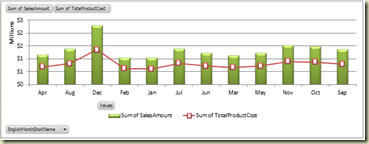
You might have noticed that I have shortened the Month Name in the chart. If you go through DimDate sheet, you will see that we do not have such a column, so, we have to create one. Scroll right in the sheet of DimDate and find the last column which is named as AddColumn. Double click on the cell and rename it as EnglishMonthShortName. Then select the new column and type this DAX =LEFT(DimDate[EnglishMonthName], 3) in the expression box. See how intelliSense works. And we will explore more on DAX in other posts.
Once you hit the Enter, all records will be filled with shortened name of the month.
Relationships among data imported
PowerPivot recognizes relationships defined between data tables (more accurately, data sheets). I have not tested this with data sources like Oracle or IBM DB2 but I am sure that PowerPivot is capable enough for recognizing relationships defined with them too. If you go for Design ribbon, you can see icons related to relationships. You can manage existing ones with Manage Relationships and can create new ones with Create Relationships. One thing you need to remember is, once data is loaded from many data sources, relationships can be created among sheets, regardless of the type of data source.
Creating PowerPivot charts – Dashboard
Okay, now we have imported data. Let’s create our dashboard. Click on the down-arrow in PivotTable Icon and click Chart and Table (Vertical) item.
Of course, you can start with a chart and add a table later too. Once the menu item is clicked, it asks whether you need it on new worksheet or existing worksheet. Select Existing Worksheet and continue. Now your screen is like this;
Chart
This is simple. Make sure Chart Area has been selected. Go through PowerPivot Field List and find FactInternetSales. Do following;
- Expand FactInternetSales in PowerPivot Field List to see fields in it. Drag SalesAmount and drop to Values box in PowerPivot Field List.
- Do same to TotalProductCost too.
- Find DimDate and drag EnglishMonthShortName onto Axis Fields (Categories).
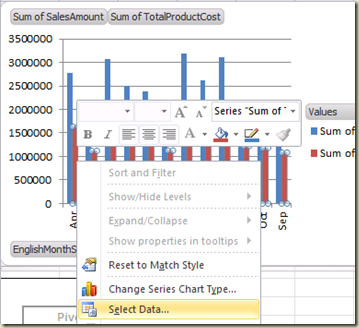
- Go to Chart Area and click on TotalProductCost bar for selecting it.
Table
Next is the Table. Select one of the cells in Table and do following with PowerPivot Field List.
- Drag SalesAmount from FactInternetSales onto Values box.
- Drag EnglishProductSubCategoryName from DimProductSubCategory onto Row Labels.
- Drag EnglishProductName from DimProduct onto Row Lables.
- Drag CalenderQuarter from DimDate onto Column Lables.
- Change the Label Column Labels in the table as Quarters.
- Select all numerical columns and format with $ icon.
- Once it is clicked, mouse icon changes to Plus and Paint Brush. Click the top cell next to Grand Total. You have a new column with same formatting now.
- Now select cells in (cells that contain values ONLY) columns Quarter 1, 2, 3, and 4. We are going to spark lines for these values.
- Click OK to fill the column. Once you have sparklines, while the column is selected, go to Design ribbon and select Visual Style as you want. Checking Markers checkbox makes SparkLine more meaningful.
- Done. Now do formatting on the Table as you need. We have successfully create two data regions for the dashboard.
Slicers
Slicers allows us to filer data easily. And, adding slicers to the dashboard is easy too. We are going to add three slicers to the dashboard; one for Year, and one for Country and another for Product Category. Slicers are added through PowerPivot Field List. Note that there are two slicer boxes in this; Slicer Vertical and Slicer Horizontal. There is no difference between these two but the placement of slicers.
Do not confuse with Report Filter in PowerPivot Field List. Report Filter is for setting filters for individual item, in this case, on either Chart or Table. Once it is set, filter is placed inside the region.
Follow these steps for adding slicers;
- Select chart areas (or one of data regions).
- Drag CalenderYear from DimDate onto Slicer (Vertical).
- Drag EnglishProductCategoryName from DimProductCategory onto Slicer (Vertical).
- Drag SalesTerritoryCountry from DimSalesTerrritory onto Slicer (Vertical).
- Done. Now you can click on items in slicer and see how data is changed in both Chart and Table.
Dashboard is completed. Note that we did not write a single query and did not use any other tools for creating this. We used Microsft Excel 2010 only. You can format the sheet as you want. You can color cells, background, add images, logs…etc.
This dashboard can be shared with others too. Best way of sharing this is, SharePoint 2010. Let’s see it with Part II.


